Search Widget
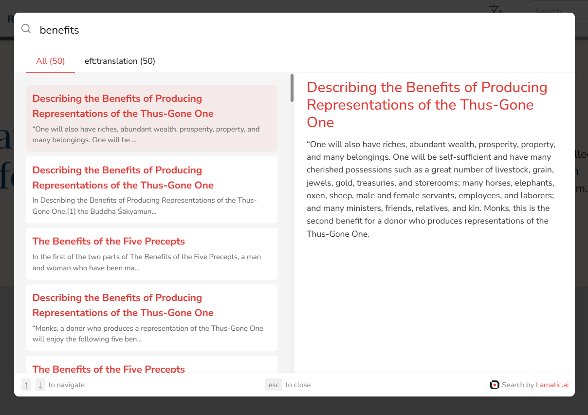
Integrate our powerful search widget into your website using the search nodes. This widget leverages AI driven search technology to provide more accurate and relevant search results by understanding the context and meaning of the queries rather than just matching keywords. Now, you can offer this advanced search functionality directly on your site.
Steps to Integrate the Search Widget
Follow these steps to integrate the search widget into your site using the provided CDN script:
1. Whitelist Your Domains
To use the Search Widget, you need to whitelist the domains where you will deploy the widget. This ensures that the widget is only used on approved domains.
- Update your
searchTriggersettings to include the domains you plan to use. - This configuration is typically done through your admin panel or server settings.
2. Include the CDN Script and Configure the Widget
Add the CDN script to your HTML file and configure the widget using the provided options.
Here’s how to include the CDN script and configure the widget:
<script async src="https://widget.lamatic.ai/search/index.js" onload="loadSearchDialog()"></script>

<script>
  // Set Lamatic config
  var SEARCH_DIALOG_CONFIG = {
    apiUrl: 'https://example.lamatic.workers.dev', // The base URL of your project endpoint (REQUIRED)
    workflowId: 'demo-workflow-id', // The workflow ID where you have set up your search configuration (REQUIRED)
    customButtonId: 'searchButton', // The ID of a custom button that triggers the search dialog
    primaryColor: '#007bff', // The primary color for the search widget (HEX value only)
    titleTextColor: '#007bff', // The color of the title text in the search results
    subTitleTextColor: '#666', // The color of the subtitle text in the search results
    width: '60vw', // The width of the search dialog box
    showNavHelperText: true, // Whether to show helper text for navigation within the search results
    showEscapeHelperText: true, // Whether to show helper text for escaping the search dialog
    searchPlaceholderText: 'Search our knowledge base...', // The placeholder text for the search input
    searchDebounce: 200, // The debounce time (in milliseconds) for search input
    linkTarget: "_blank", // The target attribute for links in search results
    breakpoint: 768, // The breakpoint (in pixels) for responsive design
    fontFamily: "Arial" // The font family to be used in the search widget
  };

  // Load Lamatic dialog
  function loadSearchDialog() { new SearchDialog(SEARCH_DIALOG_CONFIG) };
</script>
Props
Below is the documentation for the props used in the search widget configuration:
apiUrl (required)
- Type:
string - Description: The base URL of your project endpoint.
workflowId (required)
- Type:
string - Description: The workflow ID where you have set up your search configuration.
customButtonId
- Type:
string - Description: The ID of a custom button that triggers the search dialog. This prop is optional, and if not provided, the default button will be used.
primaryColor
- Type:
string - Description: The primary color for the search widget, used for the main elements like the search button. Accepts ONLY HEX VALUES.
titleTextColor
- Type:
string - Description: The color of the title text in the search results. Accepts any valid CSS color value.
subTitleTextColor
- Type:
string - Description: The color of the subtitle text in the search results. Accepts any valid CSS color value.
width
- Type:
string - Description: The width of the search dialog box. This can be set using any valid CSS width value (e.g.,
50vw,600px).
showNavHelperText
- Type:
boolean - Description: Determines whether to show helper text for navigation within the search results. Set to
trueto display the text, orfalseto hide it.
showEscapeHelperText
- Type:
boolean - Description: Controls the visibility of the escape helper text, which instructs users how to close the search dialog. Set to
trueto show, orfalseto hide.
searchPlaceholderText
- Type:
string - Description: Custom text displayed as a placeholder in the search input field, guiding users on what to type.
searchDebounce
- Type:
number - Description: The debounce time in milliseconds for API calls. This helps in reducing the number of API requests by waiting for the user to stop typing for the specified duration before sending a request.
linkTarget
- Type:
string - Description: Determines how the search result links will open. Use
_selfto open links in the same tab,_blankto open in a new tab, etc.
breakpoint
- Type:
number - Description: The pixel width at which the widget adjusts its layout for smaller screens. This value defines the breakpoint for responsive design.
fontFamily
- Type:
string - Description: The font family to be used in the search widget. Provide any valid CSS font family name (e.g.,
Verdana,Arial,Helvetica).