Brand Kit
Resources for maintaining a unified and accurate Lamatic brand presence.
Brand Colors
Logo
This is our logo. It captures the spirit of what we do. It is often the first encounter people have of us, and encapsulates the power of our product and the mission that drives us.
Logo Color Usage
Always ensure our logo remains legible on any background color, maintaining clarity and visual impact.


Logo Misuse

Don’t apply any visual effects (shadow, glow, etc.) to any of our logo
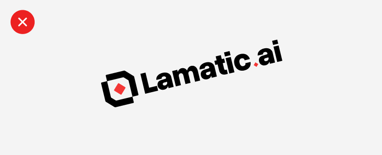
Don’t rotate our logo.

Don’t add gradients to our logo.

Don’t scale disproportionately.

Don’t add red in the iconmark in the combination mark.
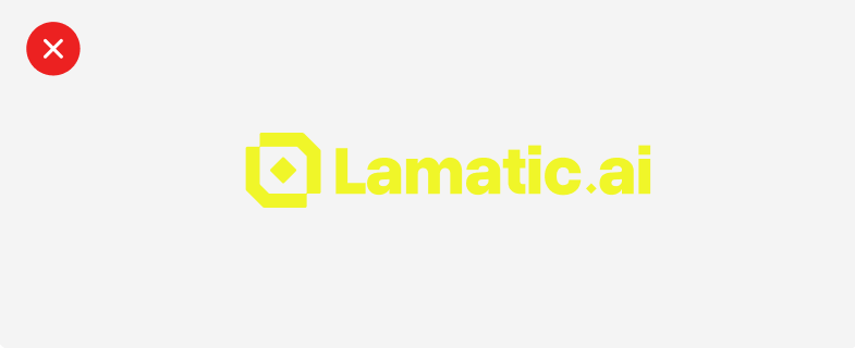
Don’t add any color.
Screenshots
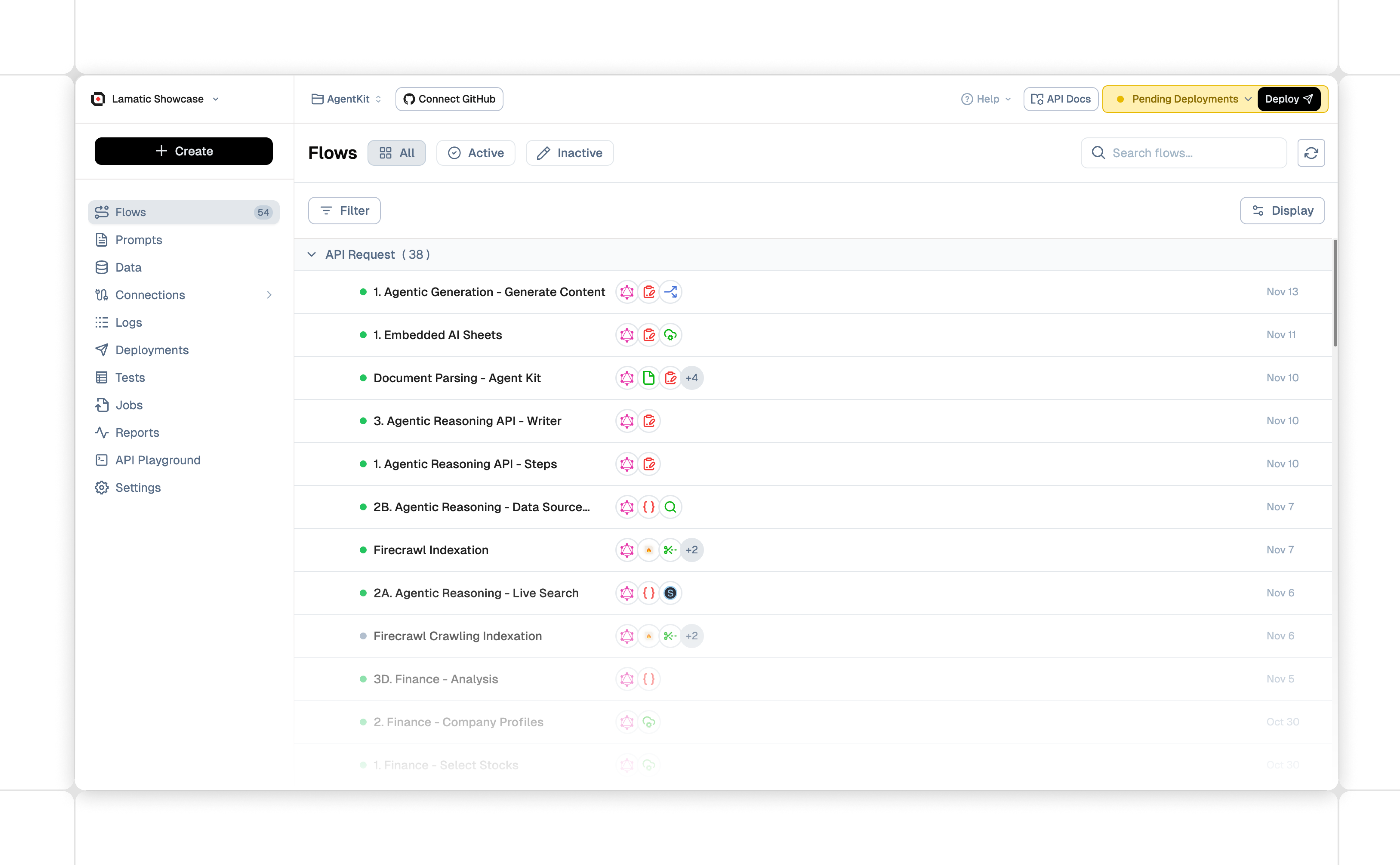
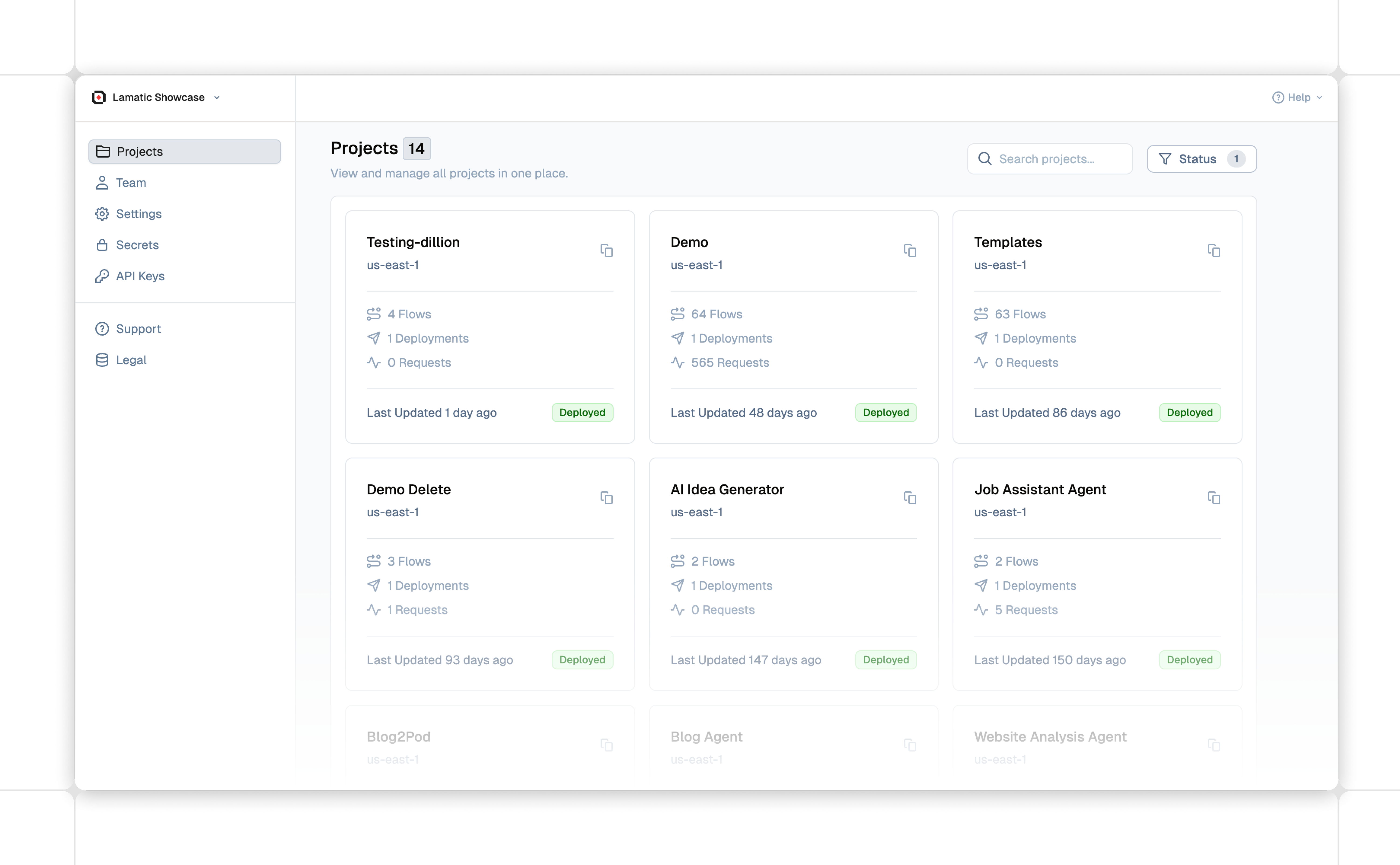
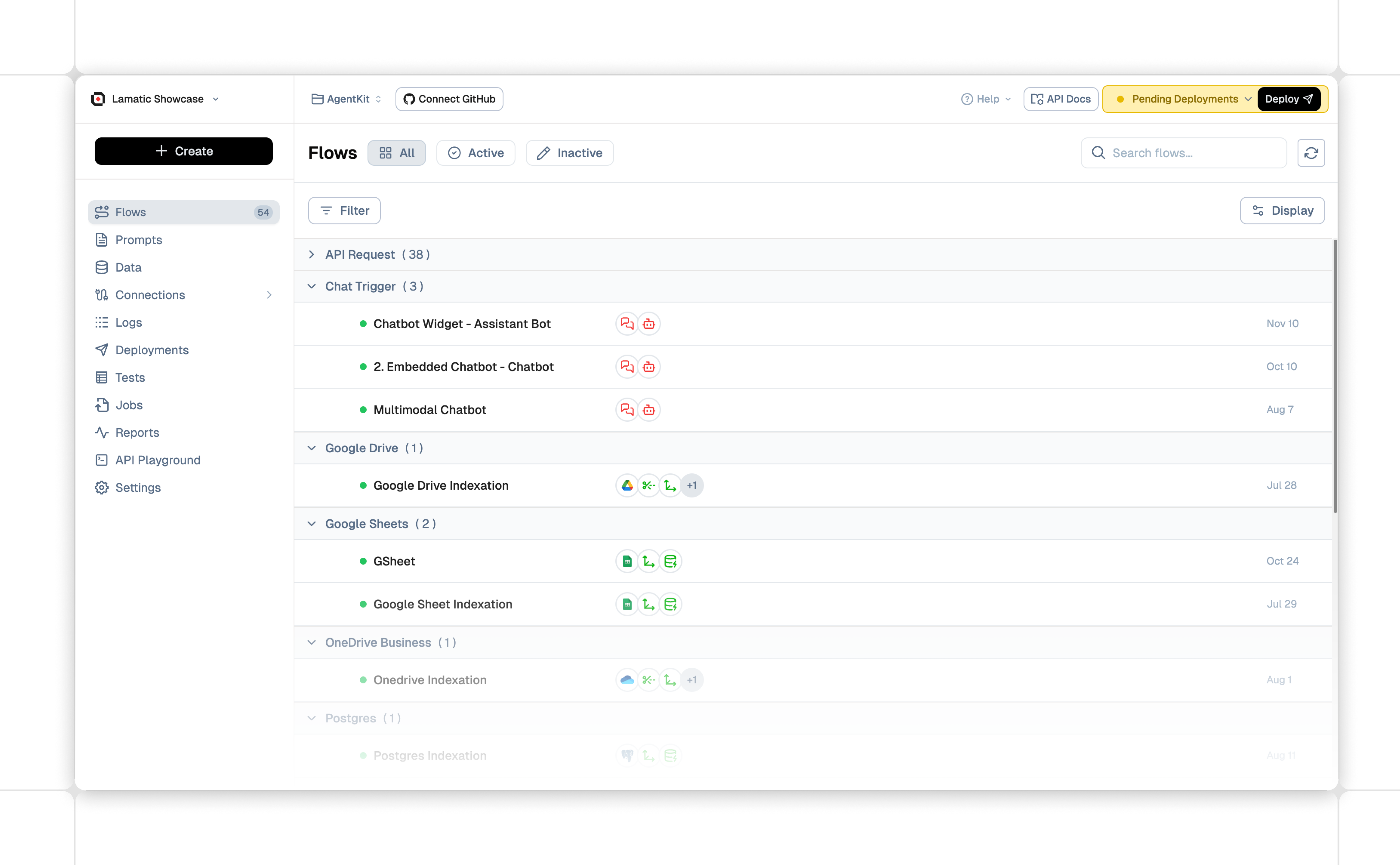
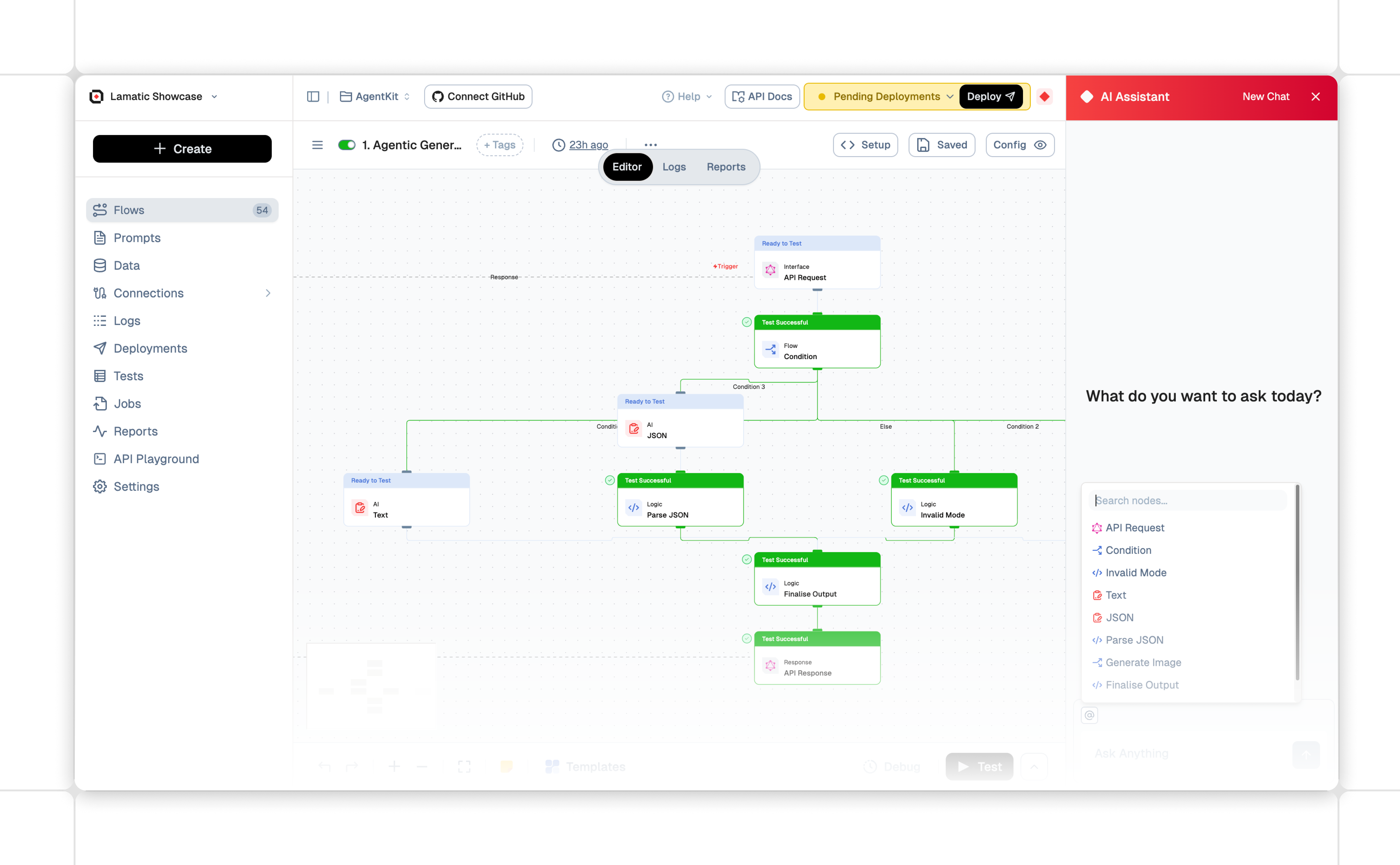
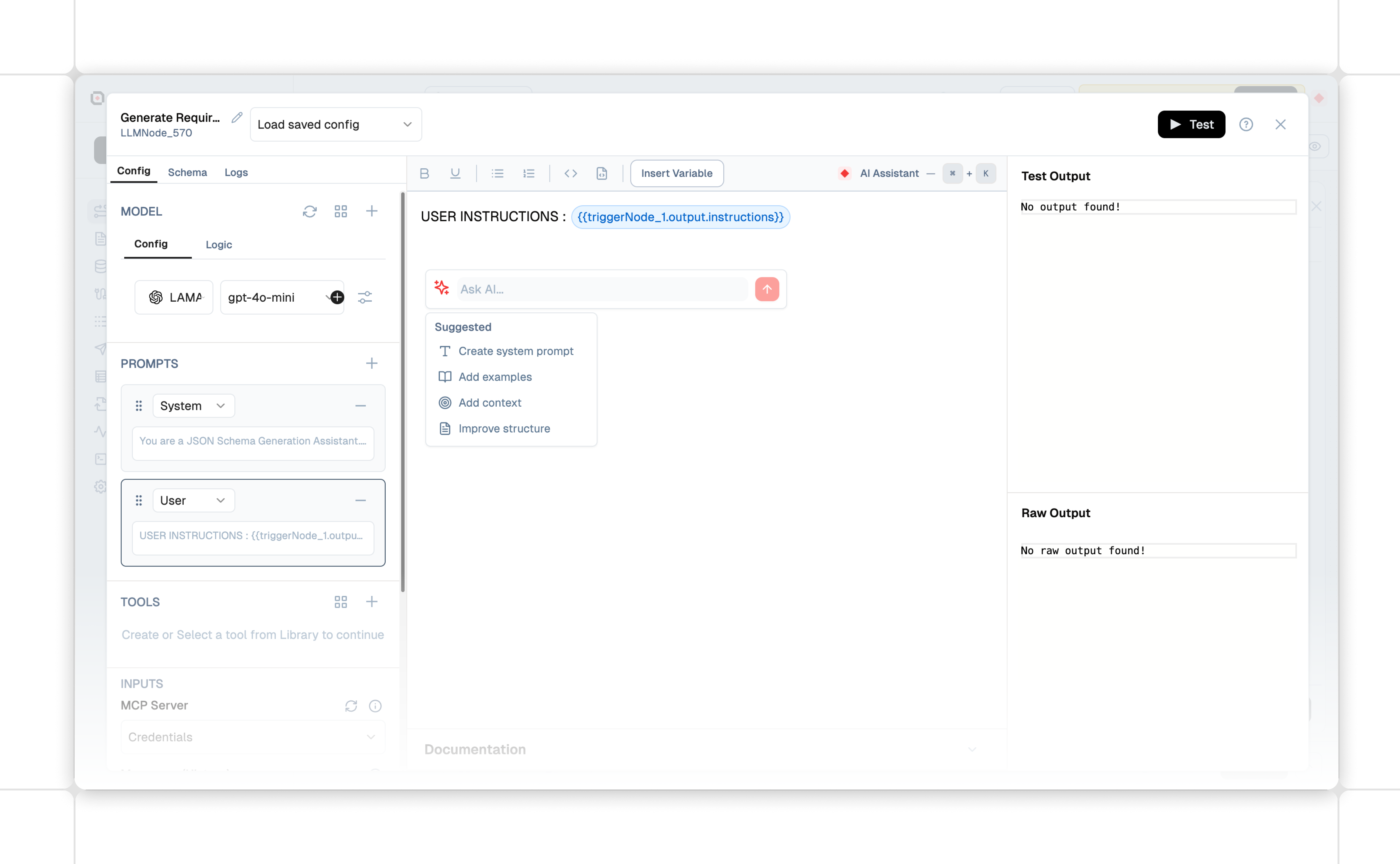
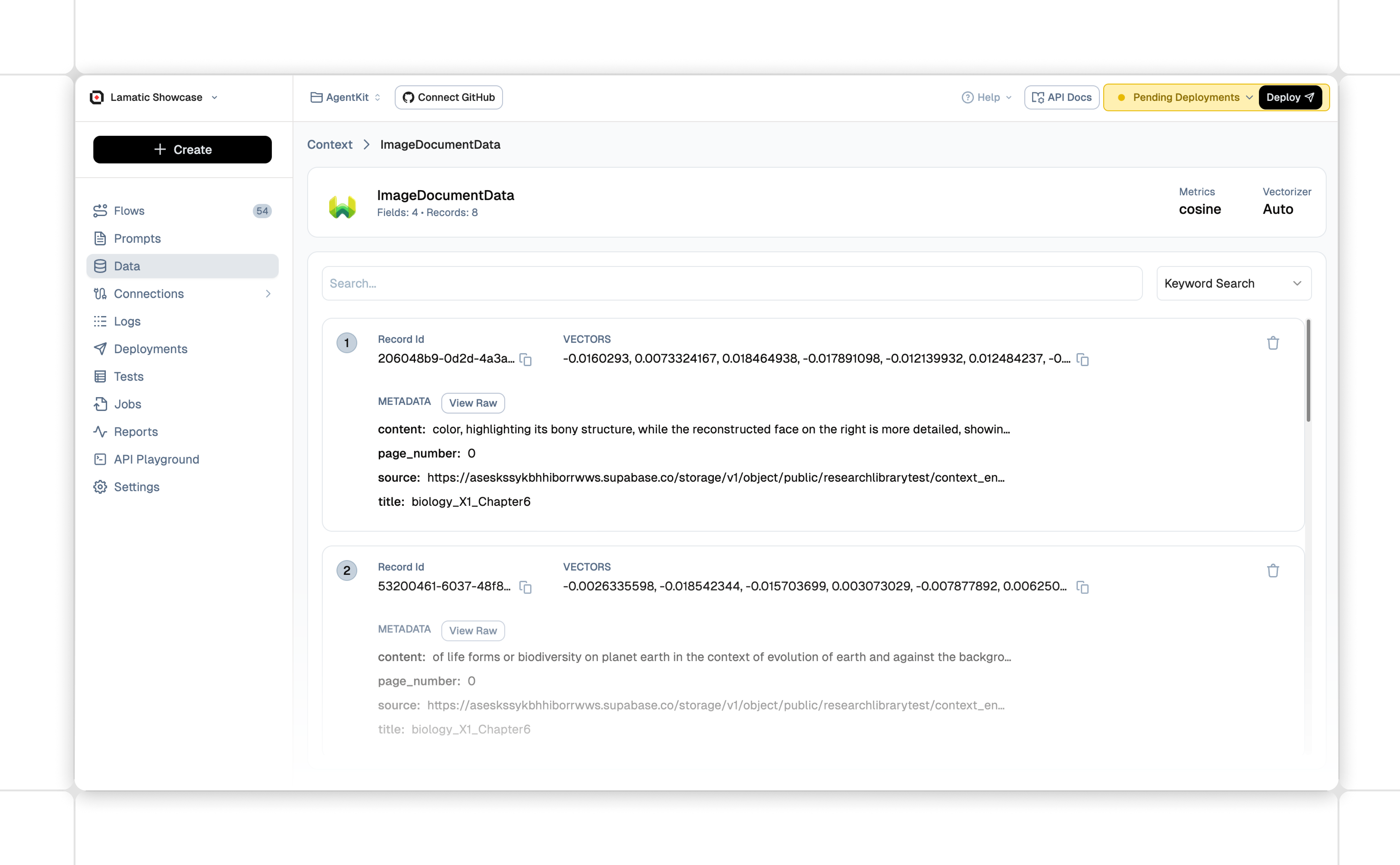
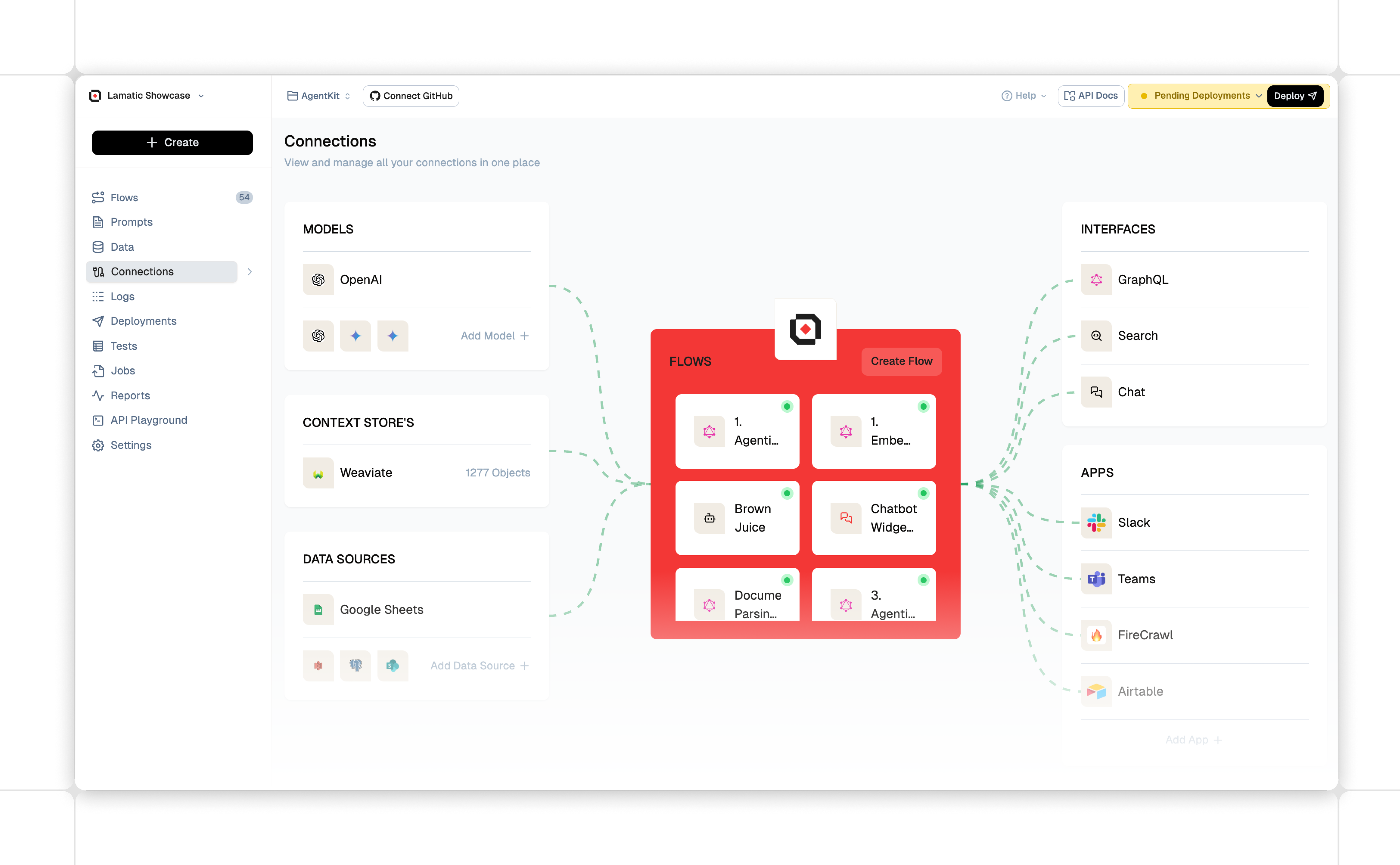
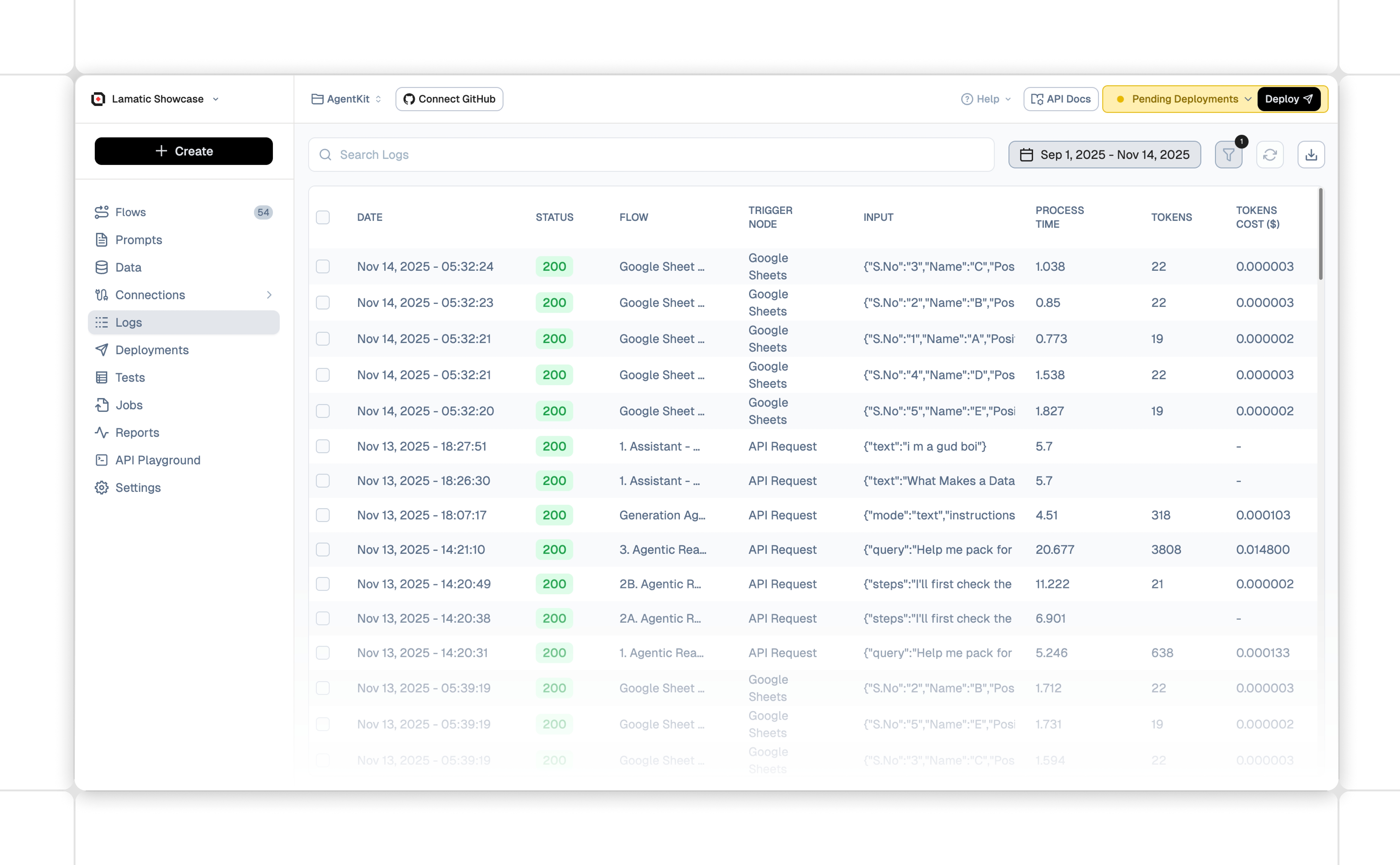
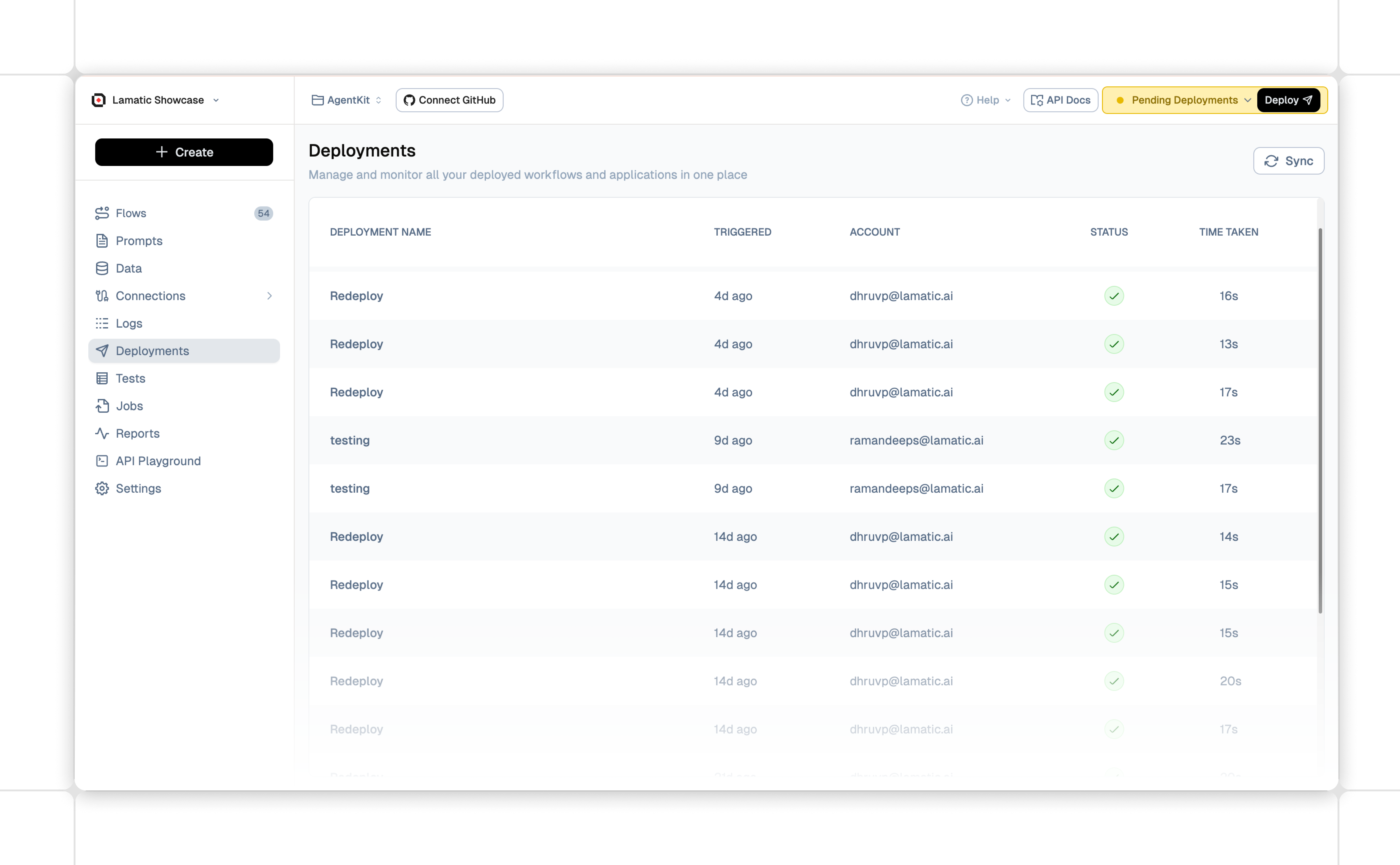
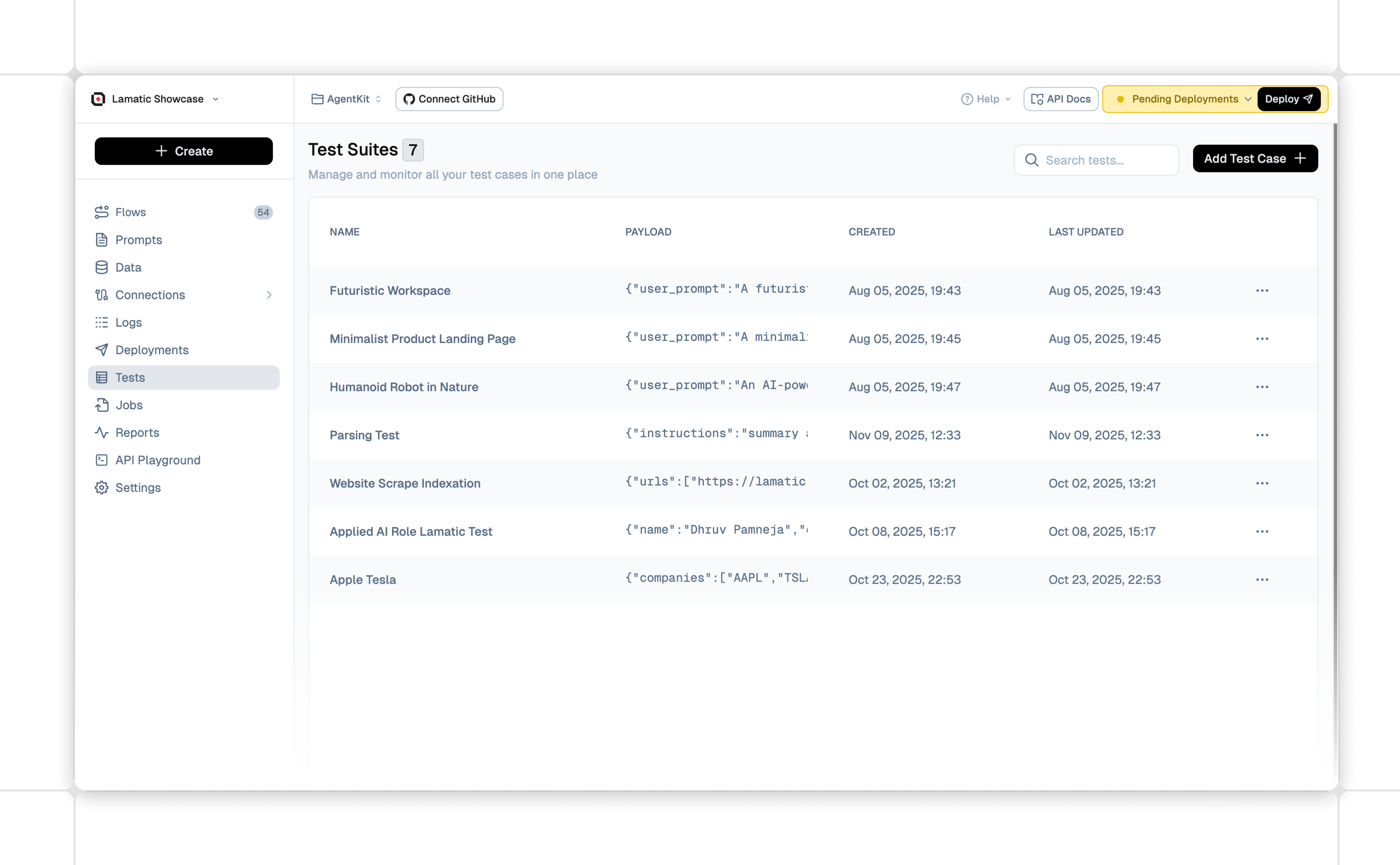
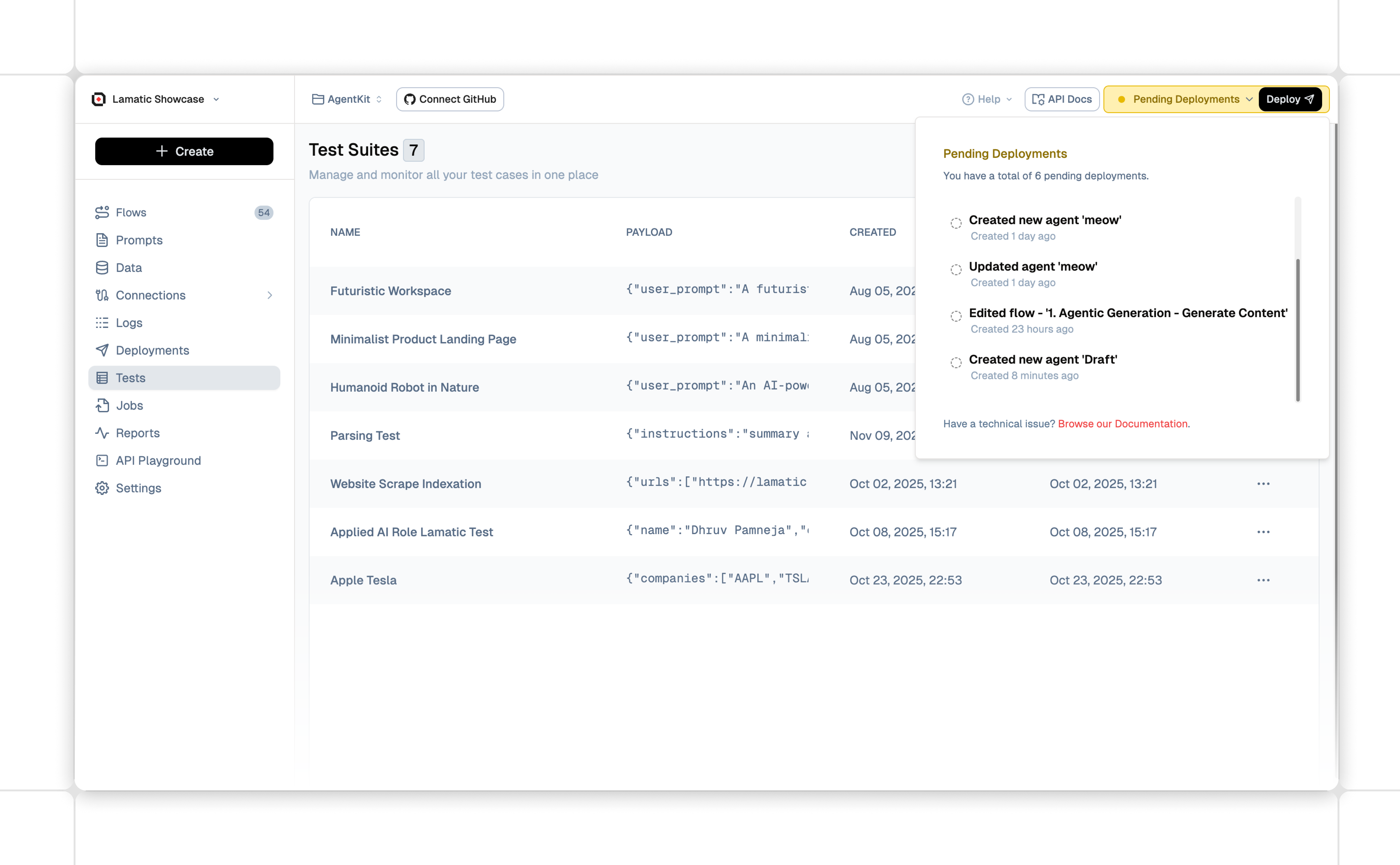
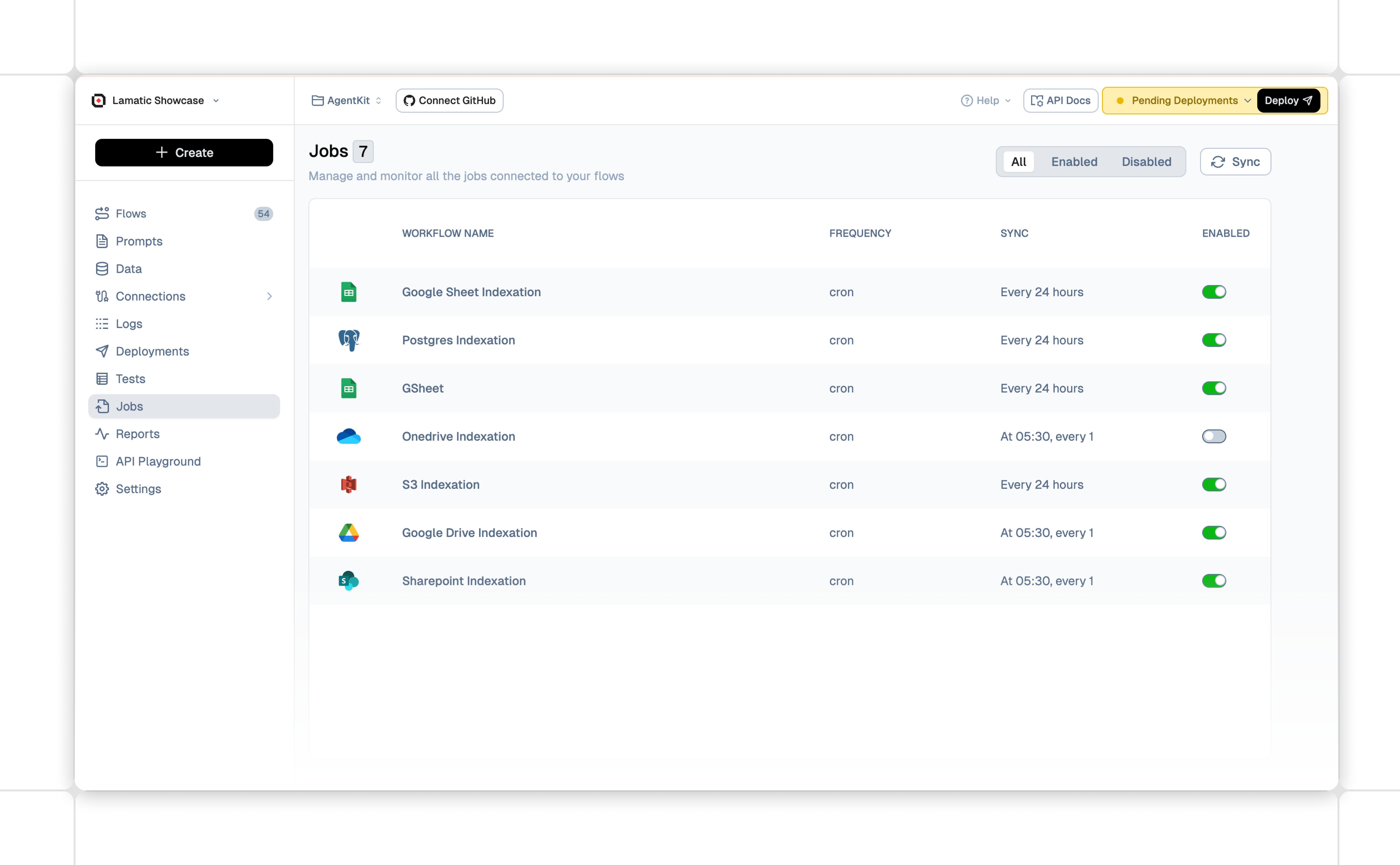
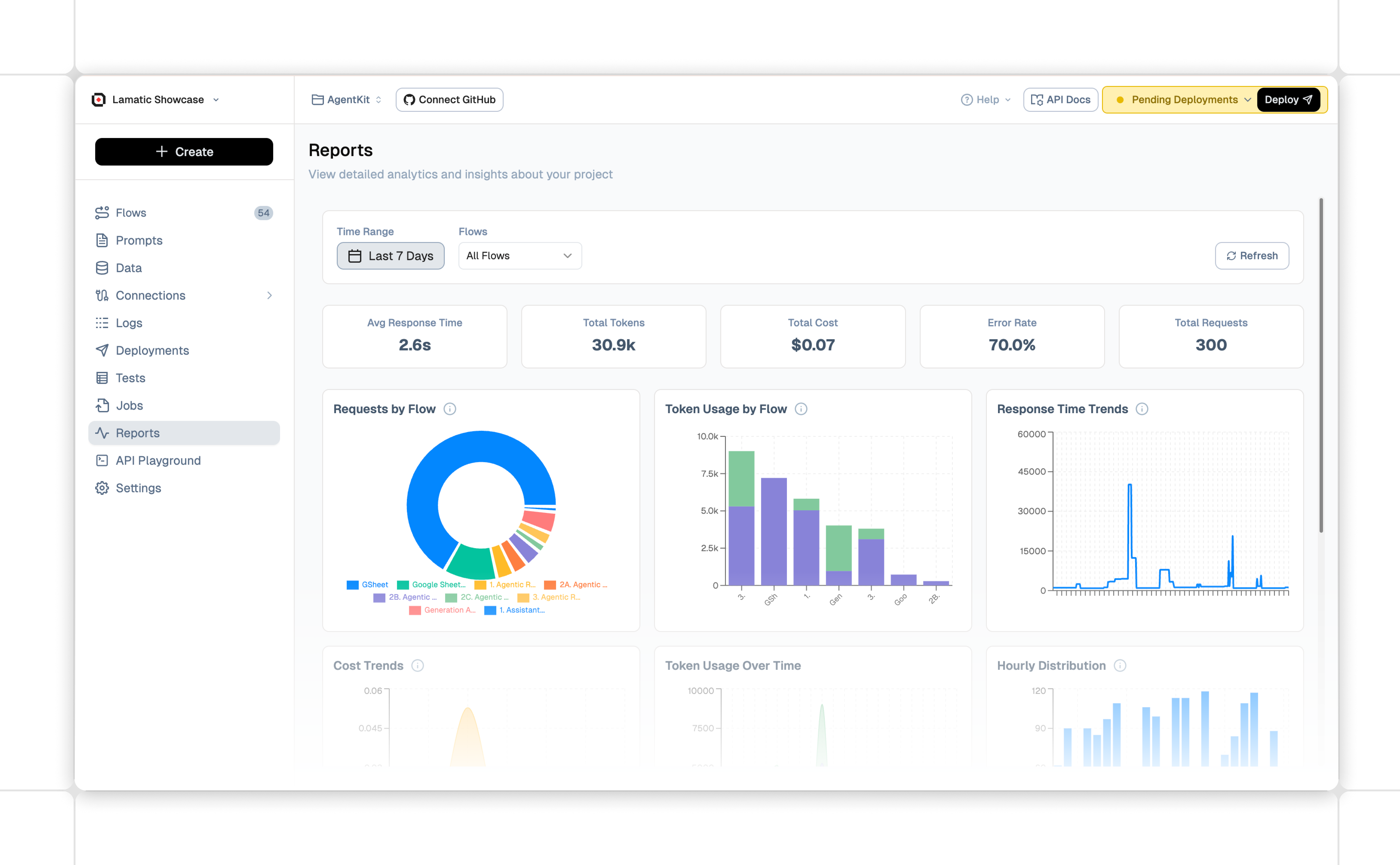
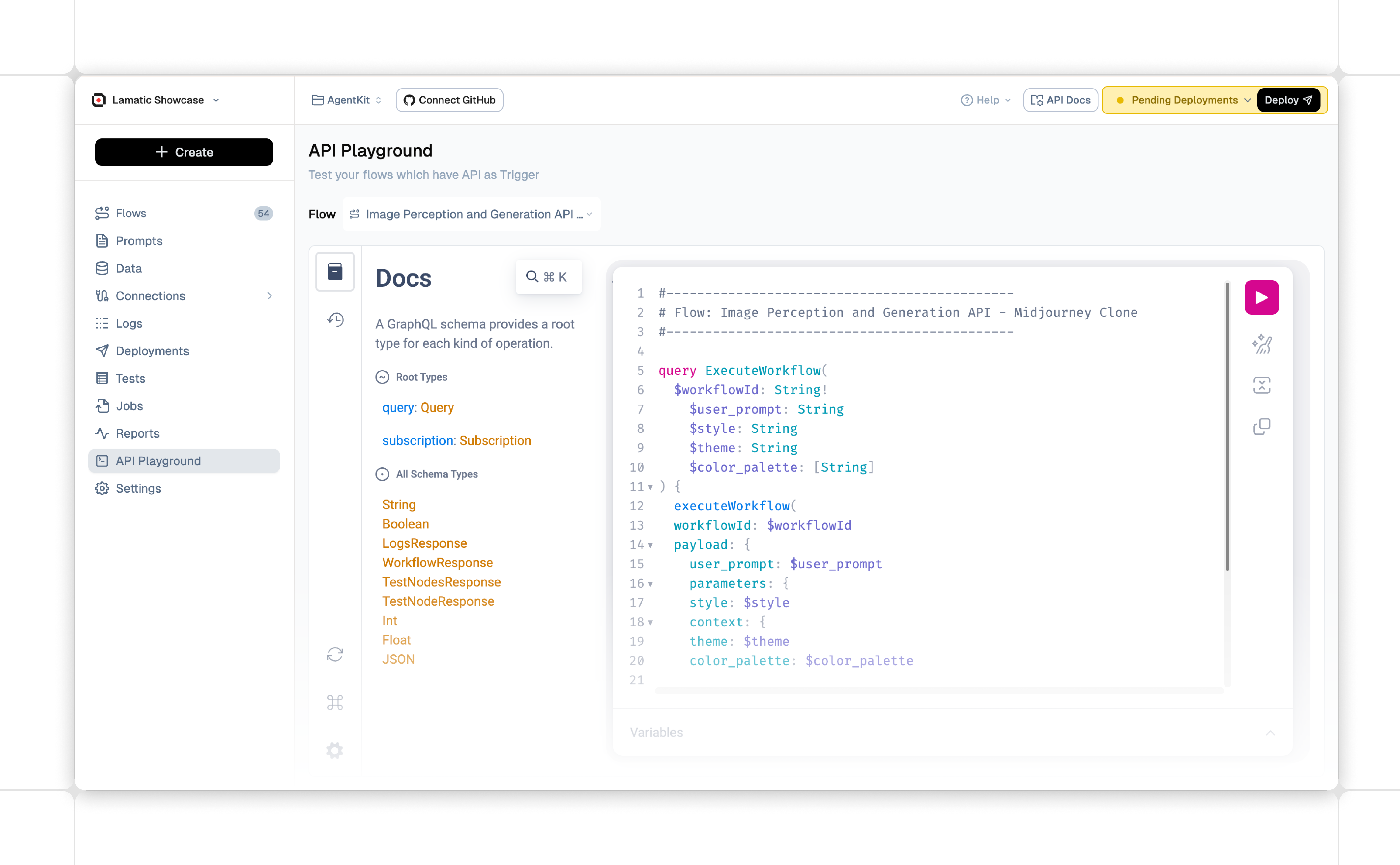
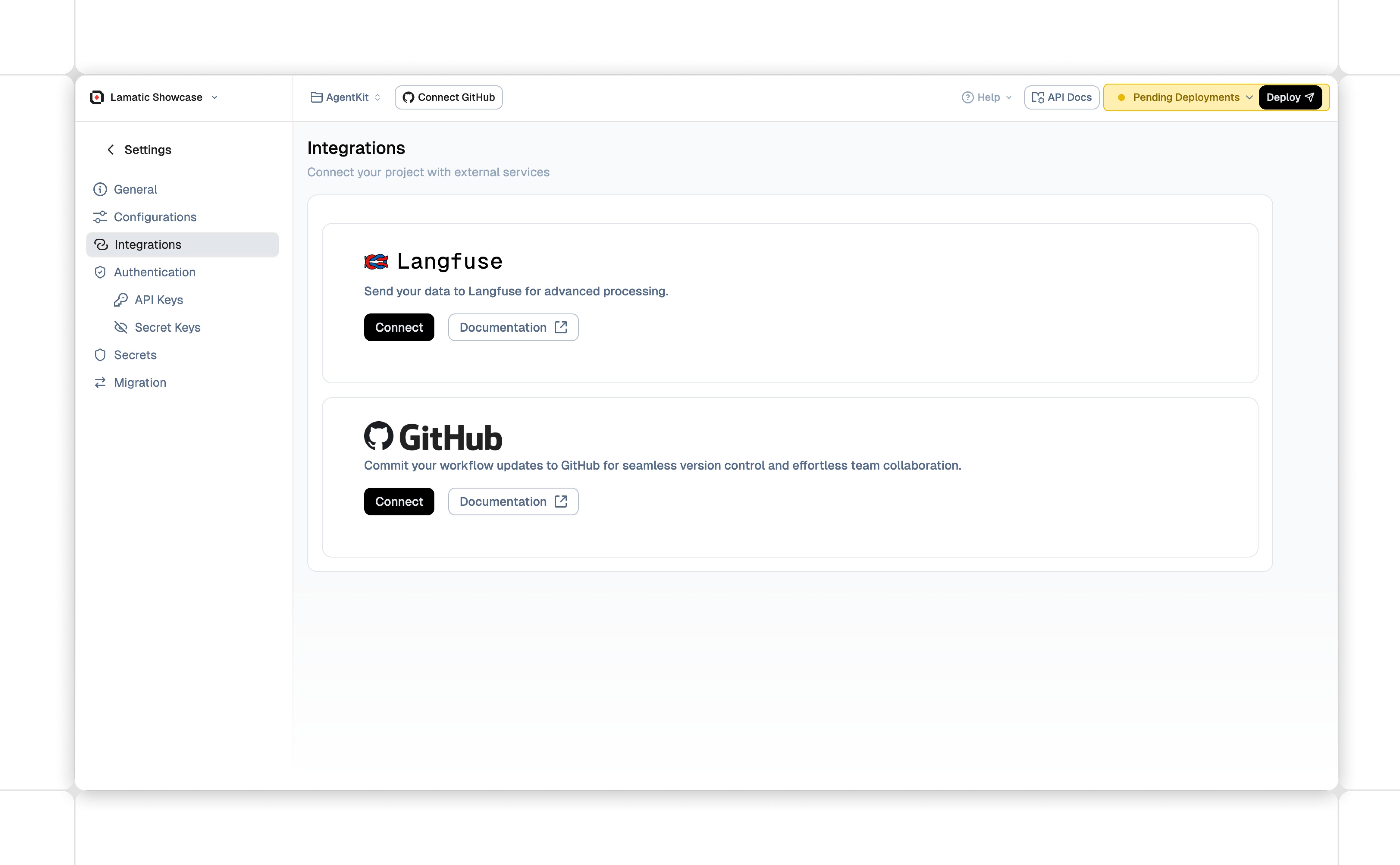
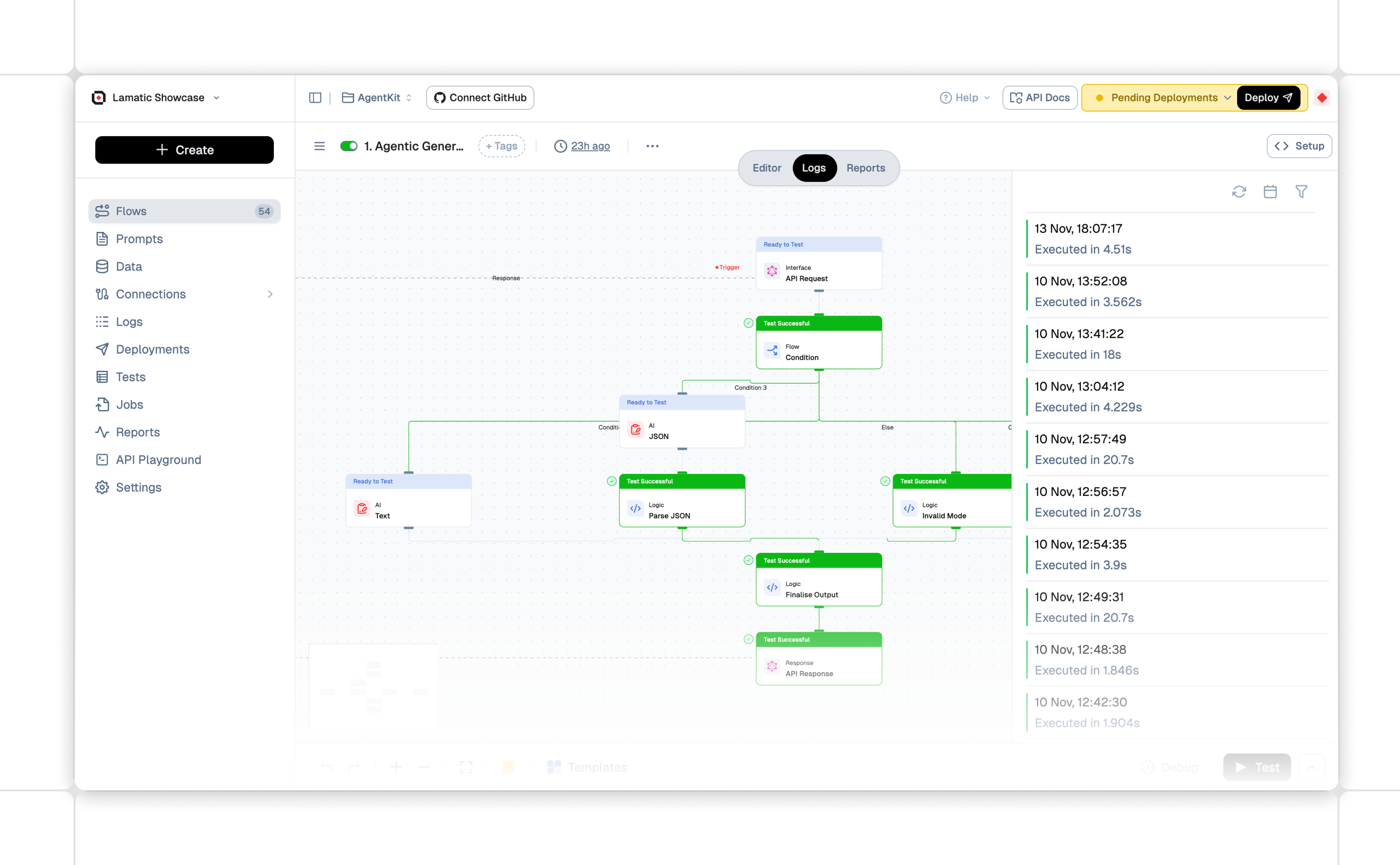
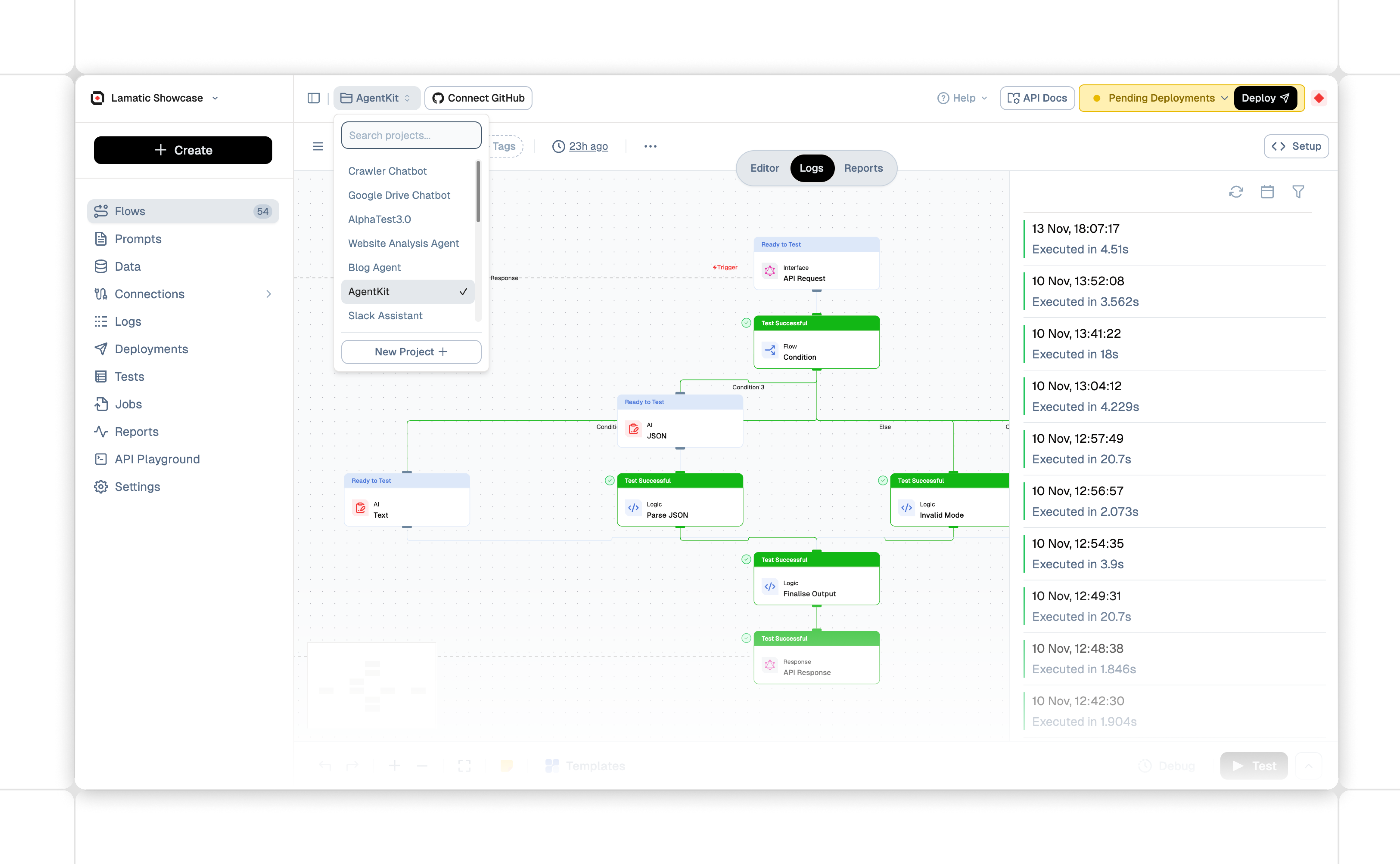
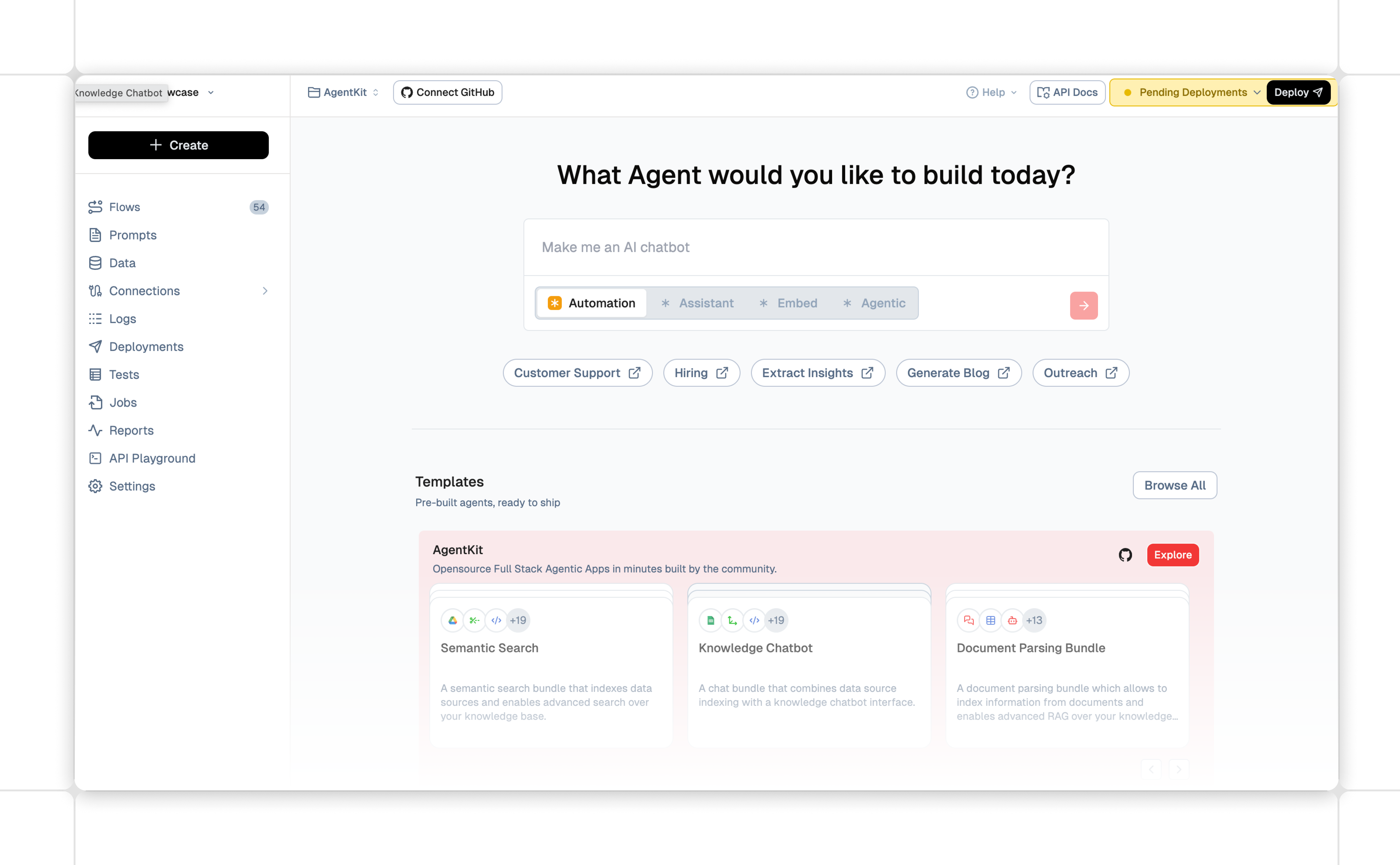
Lamatic.ai product screenshots are essential for accurate media representation and are available for use by the press. These images must not be edited in any way that misrepresents the product’s interface, capabilities, or behavior. It is important to preserve the context and integrity of all screenshots, ensuring they reflect the Lamatic.ai product truthfully and do not imply unauthorized partnerships or endorsements. Always use high-resolution versions to maintain clarity and quality in any published material.




Brand Typography
Primary typeface
Our primary typeface is Geist. It embodies readability, simplicity, and functionality, making it an ideal choice for both digital and print applications.
As our primary typeface, assign it to all text within our communications material
abcdefghijklmnopqrstuvwxyz
ABCDEFGHIJKLMNOPQRSTUVWXYZ
1234567890!@#$%^&*
Best Practice
This is our typography hierarchy, guiding how we use type to create clear and consistent communication true to our brand.
All you need to
build GenAI Apps
Ship Agentic AI Apps
Today!
Reduce Back and Forth
Collaborate
A managed PaaS with a low-code visual builder, VectorDB, and integrations to apps and models for building, testing, and deploying high-performance GenAI apps on edge.
A managed PaaS with a low-code visual builder, VectorDB, and integrations to apps and models for building, testing, and deploying high-performance GenAI apps on edge.

